

Orbis
Roles: UX Design/Research, User Testing, Visual Design, Wire-framing
Tools: Figma, Miro, Adobe Illustrator, Adobe Photoshop
Project Duration: 2.5 Months
Orbis is one of the bigger university projects we did during our 2nd year in B.A. of Design Computing. We were assigned to design a digital interface product that can be used during space travel from Earth to Mars.
Our group decided to design a behavioral assistance system, which allows passengers to create and undertake their desired tasks thus removing the friction & stress associated with spaceflight environment.
The final product took approximately 1 month to make including prototyping, user-testing, wire-framing, etc. It was an extremely interesting project to partake as I have never considered the difference in design inputs within a spaceflight environment.

Problem Statement
In order to mitigate the stress caused by space travel environments, we created Orbis. Orbis is a behavioral assistance system, which allows passengers to create and undertake their desired tasks thus removing the friction & stress associated with the spaceflight environment.
The Solution
With the rapid development of space travel to Mars by companies such as SpaceX & Boeing, there needs to be further consideration and research into mental health. Our backgorund research has shown that mental health is neglected when considered in space-travel and considerations of passenger’s mental health would be necessary for a smooth spaceflight.
User Journey Map
The User Journey Map captures the ways the personas would interact with the design itself. The two User Journey Maps describe smaller details of how the users might interact with the product as they are Extreme Personas.

User Journey Map 1

User Journey Map 2
Building Empathy
To start off this project, we decided to do user interviews & research to create two Personas named Organised Jason & Relaxed Brad. After creating these two personas, we continued on by creating a User Journey Map to understand how different users might use Orbis. To finish off, we created a Decision Matrix in order to understand the feasibility of the design & see how our design processes fits into the brief.

Organised Jason (Persona 1)

Relaxed Brad (Persona 2)
Product Flow
After conducting user research to understand the demographic & overall ideas of digital product in space, we decided to start on working on the flow of the product.
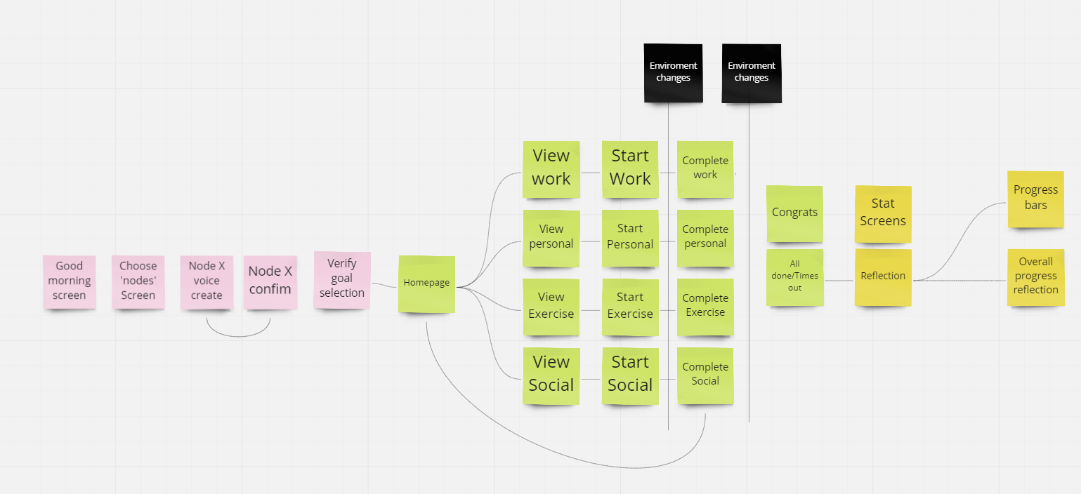
General Flow of Orbis
This led us to creating 2 different low-fidelity of Orbis, a mobile and wearble version. After conducing a heuristic evaluation on both the designs, we decided to settle on using the iPad as its main technology.
Prototyping & Heuristics

Wearable Low Fidelity

Mobile Low Fidelity
Heuristic Evaluation was done on these two designs to decided on the progression for Mid Fidelity Prototype.

Final Product


Key Takeaways
Importance of Exploration: During the design phase of this design, we encountered several issues with the animation capabilities & functionality limiations due to lack of functionality or knowledge of Figma. Therefore our group should have looked at other options such as Adobe XD, InVision, or Protopie for better UX/UI collaboration work.
User Testing: Though user tests were conducted through this design, we could have done couple of more to see potential faults in the user journey or user flow of the design.
Interviews: We realised after that we could have conducted interviews with the professors & experts of spaceflight environments at our university to gather more insights. It would have given more concrete ideas to tackle the problem statement given to us.