

SCAFFLINQ
How can we improving a mobile app and web portal experience for scaffolders using UX Research, User Interviews and more...
Introduction
My Roles:
UX/UI Designer, UX Researcher
Sector:
Construction, Design, Safety Management
Tools Used:
Figma, Figjam, Jira and Dovetail
Duration:
1 months
Current Issue
As Scafflinq is starting to move from staging to production, the client wants to validate the current design to make sure it achieves the product goal they are looking for. In addition, they want to redesign the current web portal to reflect a more modern look to other websites.
Solution
In order to solve the current issue the client is facing we proposed to do…
Workshop with PO, PM and client to understand opportunities, challenges and demographics to get a better understanding of the product.
UX audit the mobile and web portal to understand the potential issues
Conduct UX research, Field Interviews and User to validate those issues
Implement insights into current design for a refresh of UX and UI
Context
Scafflinq is a scaffolding management software that provides better safety and efficiency for scaffolding organisation. It replaces the current method of scaffold management (manual written scaffold cards) to a QR scan that allows users to know who, what, where and how the scaffold is being managed.
Our Process


Workshop & Research
Competitor analysis
From our understanding from the client and our own research, there doesn’t seem to be any comparable offers. Though there are other scaffolding management companies that provide manual scaffold management services, the digitasation of it has not been done before.
Opportunities
Flexibility in Scaffolding Management
Individual scaffold managers do not need to rely on manual methods of maintaining scaffold safety. By allowing users to use a simple QR scan, they are offered more flexibility in how they can manage their scaffoldings.
Easier Scaffolding Management
As stated before most scaffold managers use manual means such as excel spreadsheets or other tools to manage the safety of the scaffolds. Providing an digitised method of this management means less missed scaffolding = less accidents caused by scaffoldings.
Better Safety for All
By allowing the Scafflinq app to notify users of unsafe scaffoldings beforehand, it will lessen accidents caused by scaffoldings.
Challenges
Infrastructure Consideration
How would this app work if they are in a area without a stable Wi-Fi connection? This would be a difficult problem to solve and may not even be mentioned.
Acceptance from Users
As majority of the scaffolders are from the older generation, there may be a chance of technology illiteracy, which may cause frustration with some users.
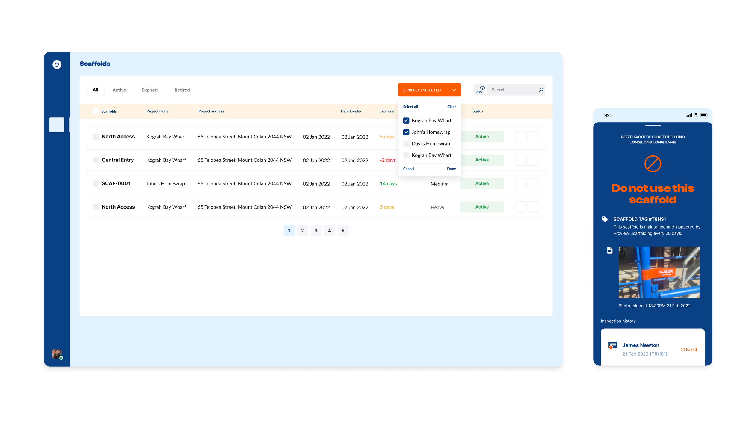
UX & Design Audit
Understanding current Hi-Fi design & information architecture
After discussing the project requirements with the PO, PM and the client, I moved onto analysing and understanding the current flow and design of the mobile app and the web portal. This allowed me to understand the overall product and what sections neede work. Here is an example of what the current app looked like…
Current Web Portal + Mobile Design
Issue with current design for Mobile App & Web Portal
Here are some issues I found with the current design from our UX Audit…
The list designs are outdated and require a redesign through inspiration.
The use of branding colors is distracting for both mobile app and web portal.
The spacing issue with the overall content of the list view/detail screen.
Inconsistent CTA placement for adding orders and more.
Overall proportion issue with the signup page.
UXR, Field Interviews and User Testing
Finding interview candidates
Once reviewed the Hi-Fi design, it was time to find candidates for a user testing session. During this process we interviewed and user tested with the following…
2 scaffolding management companies
In-house Senior UX Designer and Junior UX Designer
Interview questions
As we want to use this time to understand what we are missing from the design both functionally and design wise, we wanted to ask open-ended questions pertaining to their understanding of their app vs. their scaffold management system. We organised this through Dovetail.


Insights and questions in Dovetail

Interview Findings
Australian Standards for Scaffold Details
As the interviewees were going through the app, many of them mentioned that the scaffold details screens are missing details that are crucial to the standards that all scaffolders need to follow according to the NSW Law.
Button Placement
Many of the interviewees were confused about the placement or the location of the CTAs. This is a clear result of previous designs having buttons on the top, not at the bottom.
Payment
The app currently has a paywall that cannot be dismissed by users if they do not have a premium membership. The addition of this feature would help the users.
Minor Bugs
In addition to the major design changes, there were minor bugs that were mentioned by the users, which became evident throughout this user testing.
Reporting Scaffolds
We were missing a key function for the mobile app where the users should be able to file a report about a certain scaffold, which would then be sent to the company admin on the web portal for managing it.
Ideation & Design
Insight analysis
Now that we have a further understanding of the missing elements from the current Hi-Fi design, it was time to implement these. Our design priorities from the highest to lowest were...
Changing the scaffolding detail screen to better suit the timeline structure & following the Australian Standards
Report issue CTA to call scaffolders on site
Change sign-up flow for a better user sign-up rate
Minor bug changes (missing error states and more...)
We started off by creating the Lo-Fi design that reflects the needs of the user.


Lo-Fi to Hi-Fi
Due to the time constraints on this project, we had to skip a step and go from Lo-Fi to Hi-Fi which looked something like this.
Web Admin Portal Redesign
Redesign curren portal
Once the design for the mobile app was finalised with the clients approval, we moved onto the UI revamp for the current web portal to something that is simplified and more usable. The original web portal design was good enough for getting the core functionality across to its users, but there obvious issues with the designs including its list view, profile settings and more.
I started the UI revamp by looking at the current design and comparing it to different inspirations I found across other sites.
Current Web Portal Design

Finding inspiration
After looking through the issues with the current design and going through this with the PO and the PM, I started looking for inspiration. Here are some examples below…

While keeping the current branding and over all aesthetic, the redesign now looked something like this. It focused mainly on standardising the designs, making navigation and CTA access easier.
Web portal redesign overview
My understanding from the PO, PM and the client was that they wanted to keep the overall aesthetic the same (branding, list view, etc), but with a touch of modern UI involved. As they wanted to market this product to other scaffolders, we needed to keep the design minimal and aesthetic.
After achieving the requested design, the PO, PM and the client asked whether we can provide a design without any branding as the current color pallet was distracting. In addition, they wanted me to iterate on the current sorting functions as the tab design seemed old.
From here I moved onto my final variation of the design...
Finalising web portal redesign


First Redesign for Web Portal
Final Redesign for Web Portal
Conclusion
Scafflinq brings the idea of modernising the old ways of management into reality. With the help of the clients and fellow scaffolders, this project became an amazing success overall in terms of execution and design.
With this advancement, we will hopefully see many benefits it would bring such as...
Improved safety
Better tracking and reporting
Increased efficiency
Increased collaboration
Enhanced mobility

If we had more time…
Quantitative and Qualitative research at the beginning along with the client workshop would have given us more insights into the issue at hand.
Further exploration of design concepts and pathways using Personas, Journey Maps and more. There was a lack of these at the beginning of the project, which should have been used.
More testing on the old and redesigned app/web.
Further iterations.
Learnings
#1 Expect the unexpected
The client's decision to completely remove the branding and or certain designs were a huge curveball when it came to redesigning the web portal. Though this wasn’t a drastic change, it was much of a surprise to us and the other designers included.
#2 Research, research and research more
Though the research element was limited due to the time-constraints and the client wanting this app on production as quickly as possible, we cannot neglect the importance of research even if its small. I would gladly throw myself into a full on research role if time permits it.
#3 Organising designs through user stories
Applying user stories to organise my design was a massive help when it came to big projects like this. Understanding what designs are being created without the need to reference the user journey every time was amazing. I would love to implement this into my own designs in the future too.